Design Principle

Design Principle

Tribe Academy's designs approach is futuristic yet dynamic with our two accent colors. They should be modern while constantly seeming friendly.


The Logo

The Logo

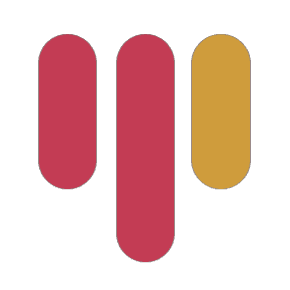
The Logo is a 'T' shape made from three long pill forms. One pill is light gold in tone, while the other two are pinkish red. Most of the elements in our designs are rounded. Our brand identity is centred on the design of the pill shapes. Designs should make use of the two colours.


The Colors

The Colors

While the pinkish red hue is the focal point of our brand, the gold color represents our commitment to superior quality.

While the pinkish red hue is the focal point of our brand, the gold color represents our commitment to superior quality.

Primary Colour

Primary Colour

#C43C53

#C43C53

Secondary Colour

Secondary Colour

#CF9D3C

#CF9D3C

Background Colour

Background Colour

#000000

#000000

The Font

The Font

"Core sans M" is the official font we use for the Tribe Academy text. "Tribe" is bold, and "Academy" is regular. Any standard font, such as Open Sans or Roboto, can be used for the secondary and paragraph fonts. download the fonts below.

"Core sans M" is the official font we use for the Tribe Academy text. "Tribe" is bold, and "Academy" is regular. Any standard font, such as Open Sans or Roboto, can be used for the secondary and paragraph fonts. download the fonts below.

Illustrations

Illustrations

For design elements and illustrations Tribe Academy uses 3d illustrations, 3d abstract shapes, 3d icons. and pill shapes that resonates with the logo.

For design elements and illustrations Tribe Academy uses 3d illustrations, 3d abstract shapes, 3d icons. and pill shapes that resonates with the logo.